Product Management
Fall 2018 Clicktime Exercise
ROLE
Product Manager
MEDIUM
Figma
Improve an Existing Product/Feature
Select a piece of software that you use regularly and are passionate about, and identify a part of the product that you feel is missing or needs improvement. Be sure to explain the rationale for your selection. As a bonus, support your explanations with screenshots of the product/feature you selected, and mock-ups or drawings of the changes you’re proposing.
"Save content from everywhere"
A holy grail app that I have downloaded onto every phone I have ever own(ed) is Pocket. While smart phones give us access to unlimited information right at our fingertips, Pocket allows for users to save articles and videos in one location, offline! Users are able to curate a list of content that express personal interest and filter out a lot of floating cyberspace junk.
But what is next?
As a loyal user of 5 years, I have seen their growth from incorporating a search function, to being able to listen to articles with their latest text-to-speech update. While these are significant improvements to the usability of the app, I am still patiently waiting for the day Pocket will release the option for users to create and customize categories in-app, to compartmentalize the content saved.
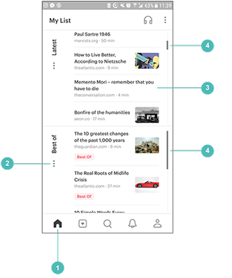
Current pain points
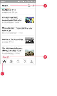
1a
Global navigation; hard to toggle between 'home' and 'tag' due to size constraint
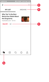
1b
Global navigation; hard to toggle between 'tag' and 'home' due to size constraint
2
'My List' appears in chronological order upon opening
3
Tags are color coded, but cannot be clicked on
3
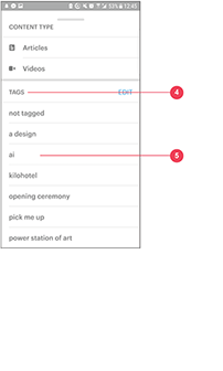
4
Alphabetized and editable, but difficult to find
5
Creation of new tags
6
Difficult to find, tags disappear
The current home screen load articles and videos in the order that you save them in. Issues arise when:
1. Long-time users do not have the home screen organized in a customizable convention
2. Tagged content are not accessible from the home screen
Solution: Many pockets!
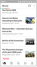
Old home screen
1
Global navigation; no more toggle between 'home' and 'tag'
2
'Tag' card organization and customization; push and pull desired cards to the top
3
Scroll bar to give visual indication as to how much content are in each card
4
Each 'Tag' card only reveals last 4 articles saved
As a redesign for the home screen
I wanted to integrate a left column where the “tags” are more visually apparent whilst still keeping with the theme of having the latest articles saved at the top of the screen. The addition of the "tags" cards allow for users to have the freedom to customize their "home" page in the order of their choosing. Each "tags" card will only show 4 articles. This will minimize time spent scrolling for an tagged article, and pack together topics into one space on the screen!
< back